
The daily front door for 30,000+ employees across Dubai Holding group including hospitality, real estate, leisure, and corporate businesses.

Dubai Holding is one of the largest diversified groups in the region, with tens of thousands of employees across Jumeirah's hospitality portfolio, Dubai Holding Real Estate, Dubai Parks & Resorts, and corporate functions.
TechHub is the single internal portal those employees use every day to raise IT requests, access tech services, find information, and resolve issues — built on top of ServiceNow's Employee Service Delivery (ESD) platform.
It serves a user base most consumer products would consider impossibly diverse: a front-of-house hotel staff member on shift, a corporate finance lead on a desktop, a leisure park operator on a handheld, a contact centre agent on a workstation. Different roles, different devices, different contexts, different levels of digital fluency — all using the same product.

The problem
A high-traffic enterprise portal is one of the hardest design challenges in software. The defaults work against you:
→ ServiceNow's out-of-the-box templates are functional but visually flat, with a UX that prioritises configurability over clarity
→ The user base has wildly varying needs — IT support, HR queries, facilities, access requests, knowledge — and all of them want to land in the right place fast
→ Most users arrive when something is already wrong — they're frustrated, time-pressured, and often on mobile
The goal wasn't to redesign every flow. It was to build a daily-use portal that felt clear, fast, and trustworthy at the moment of need, while respecting the constraints of the platform underneath.
I led product design for TechHub end-to-end:

The first move was to understand what employees actually came to TechHub for. Not what stakeholders thought they came for. By cross-referencing ticket data with stated user needs, the top 5 reasons for visiting the portal became clear — and they were not what the original navigation prioritised.
The redesign surfaced the most common journeys at the top of the experience, treating less frequent paths as secondary navigation rather than equal real estate.
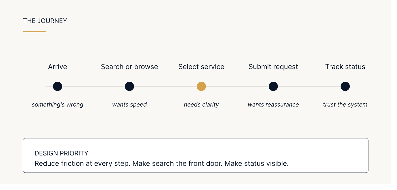
For a portal serving thousands of services across multiple business units, no navigation tree can scale. Search had to do the heavy lifting.
I redesigned the search experience to handle vague natural-language queries, route users toward the right service category, and surface relevant knowledge articles before they even submit a request — reducing the load on agents and getting users to answers faster.
Users arrive at a service portal because something is wrong. That context matters. Tone, visual calm, clarity of next step, and visibility of request status all became design priorities. The portal had to feel like it was helping, not adding to the problem.
A significant portion of TechHub's user base — hotel staff, park operators, frontline employees — primarily uses mobile during their workday. The portal had to work for them with the same fluency as it did for desktop corporate users. Layouts, touch targets, and progressive disclosure were rebuilt with the mobile context as a primary, not derivative, surface.

ServiceNow is an opinionated platform. Trying to design as if it isn't leads to designs that can't ship. The most valuable design work I did was learning what was customisable, what was constrained, and where the team could push beyond defaults — collaborating closely with developers on what was buildable rather than designing in isolation.
A few decisions worth calling out:
Progressive disclosure over dense screens. Enterprise portals often try to surface everything at once. We chose to lead with the most common actions and reveal complexity on demand. Easier to scan, easier to use.
Search-first over navigation-first. A traditional category-driven navigation would have looked more "complete," but it would have buried the most-used paths. Surfacing search prominently was a trade-off in perceived comprehensiveness for actual usability.
Visual restraint over visual richness. A service portal at the moment of frustration is the wrong context for bold colour, dense imagery, or animated elements. The visual system leans toward calm, clarity, and hierarchy.
Consistent patterns over bespoke solutions. Across the portal, similar problems are solved with similar patterns. This made it easier for users to learn the system once and apply it everywhere — and easier for the dev team to maintain.

What it taught me
Designing for 30,000+ users every day teaches you a different kind of design discipline:
Outcomes
→ Adopted across Dubai Holding's businesses as the standard internal service portal, used daily by 30,000+ employees
→ Validated through ongoing user feedback, support data, and stakeholder reviews across business units
→ Reduced friction in the most common request journeys through search and IA improvements
→ Established design patterns that are now reused across other Dubai Holding ServiceNow products
→ Recognised internally as a model for how enterprise platforms can deliver consumer-grade UX


This case study is intentionally light on screens. Most of this work is under NDA, but I'm happy to walk through the actual designs, decisions, and outcomes in detail during an interview — including process artifacts, before/after comparisons, and the specific design system work that came out of this project.

